whispir
Capisce & Motivo
Whispir x Colophon
Bespoke typography presents brands with an opportunity to extend their identity. As much as colours and logos, unique typefaces allow a brand to radiate their look and feel through the characters people look at as much as the words those characters make up.
Which is why creating a bespoke font was an opportunity Whispir couldn't pass up.
In collaboration with Colophon Foundry, we've created a set of serif and sans serif typefaces that ooze Whispir.
Introducing Capisce and Motivo
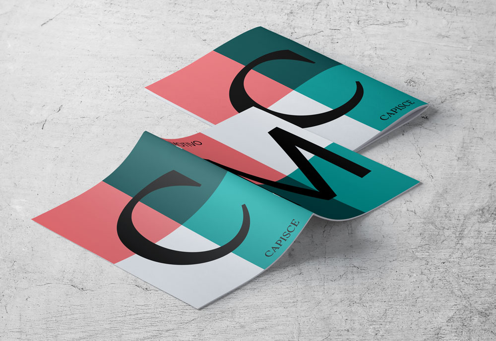
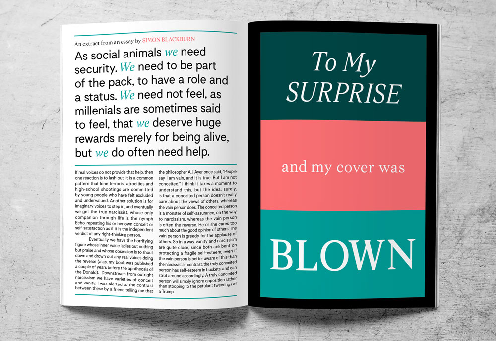
Capisce - Italian for “Do you understand?” - is our serif typeface. It’s expressive, opinionated, isn’t for everyone, and doesn’t try to be - kind of like us. Self-assured and confident, its attitude resonates throughout each character.
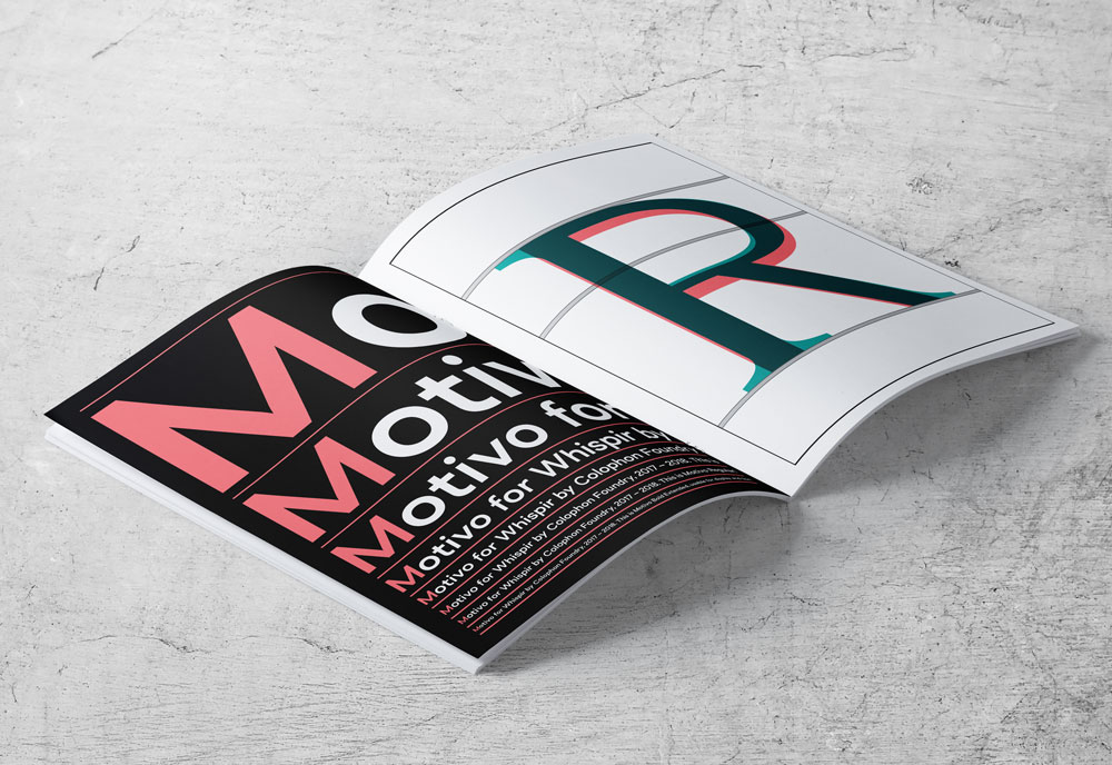
Motivo - Spanish/Italian for motive or reason - is the more straightforward cousin of Capisce. It’s a carrier of information, with the ability to influence and persuade. The balance and harmony between these two typefaces reflects Whispir's complex personality. They’re strong and articulate, yet quirky and full of empathy.
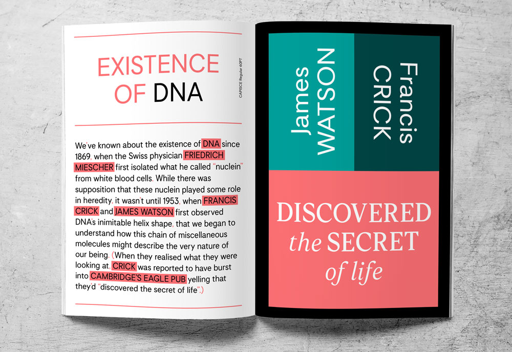
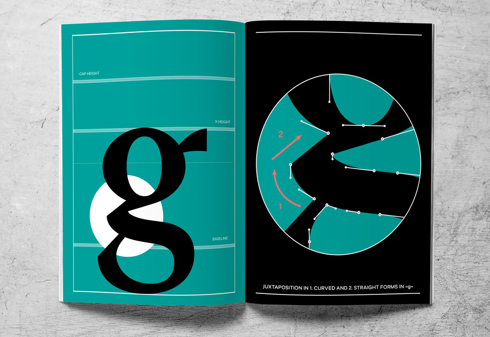
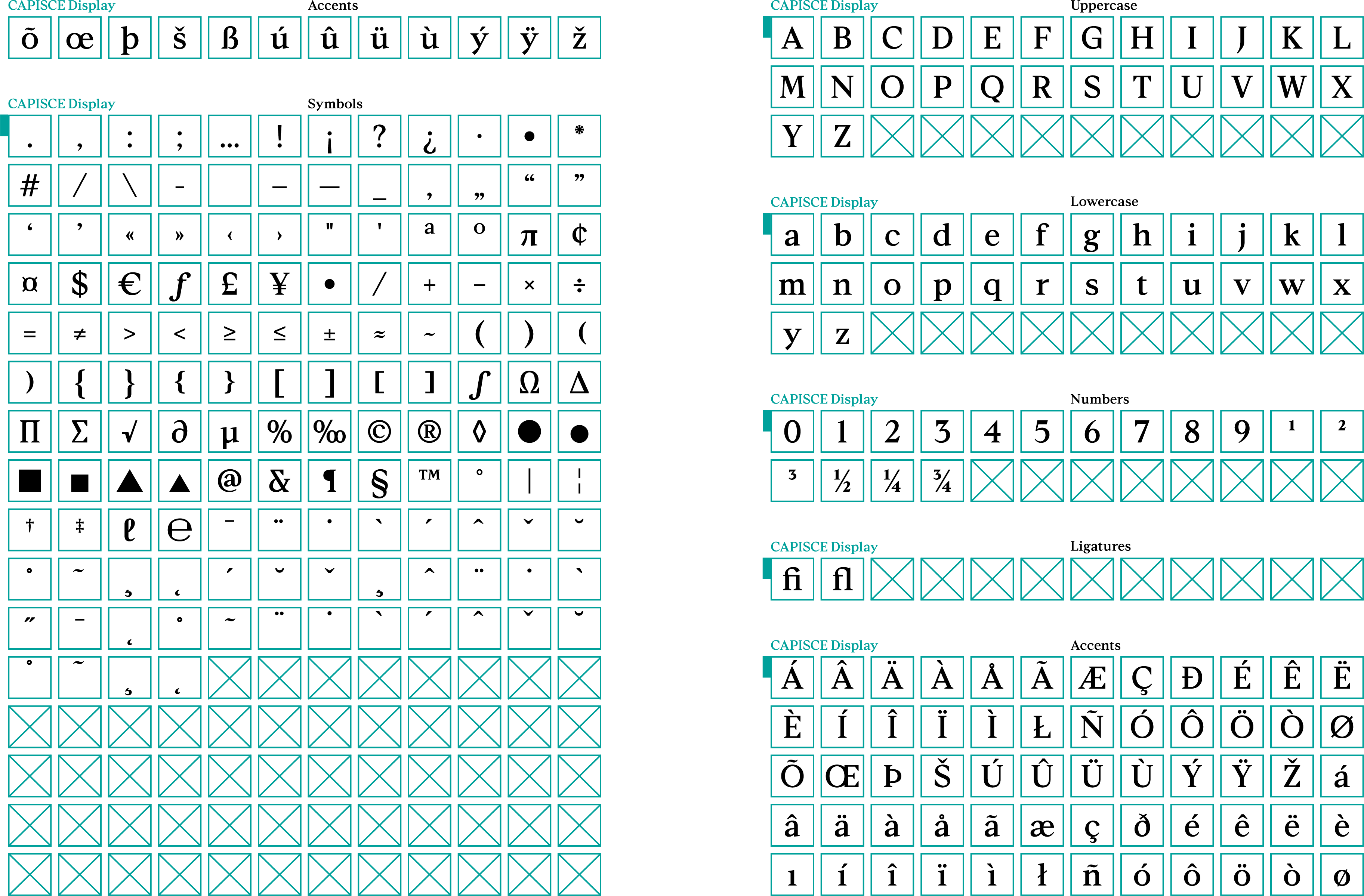
Capisce — Serif
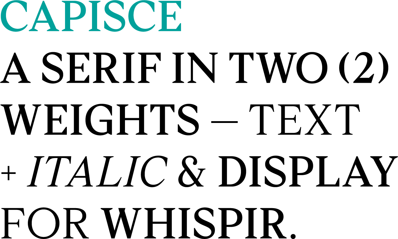
Capisce text character set
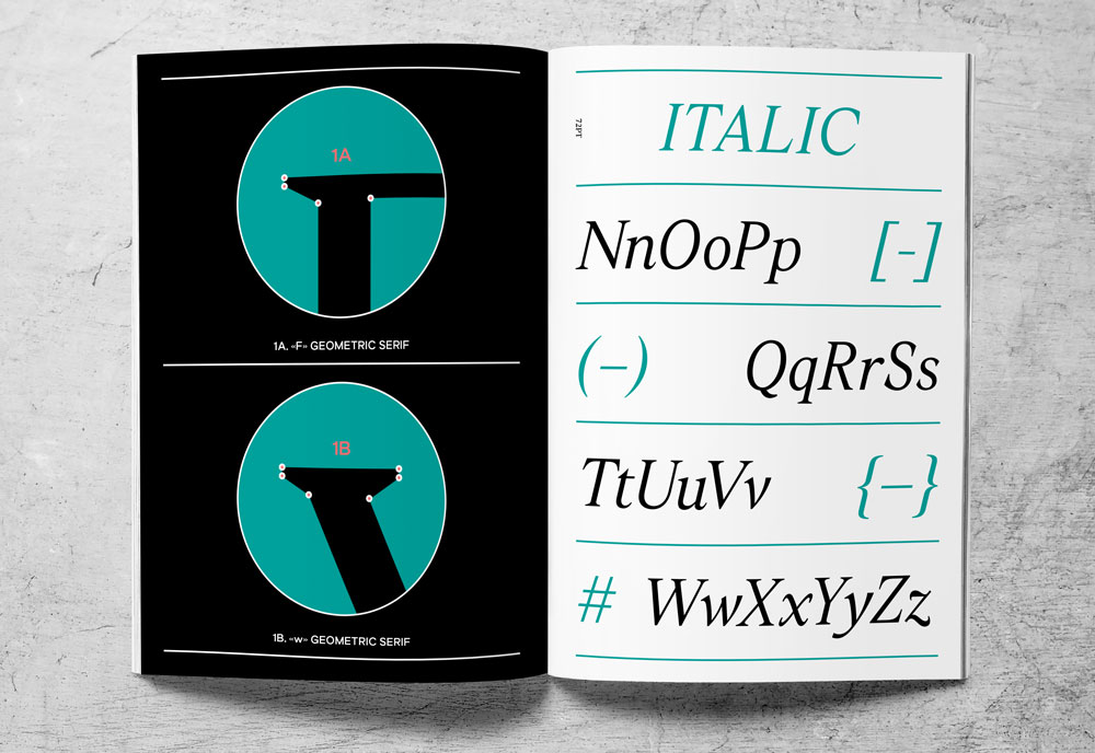
Capisce text italic character set
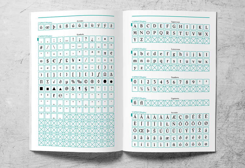
Capisce Display Character Set
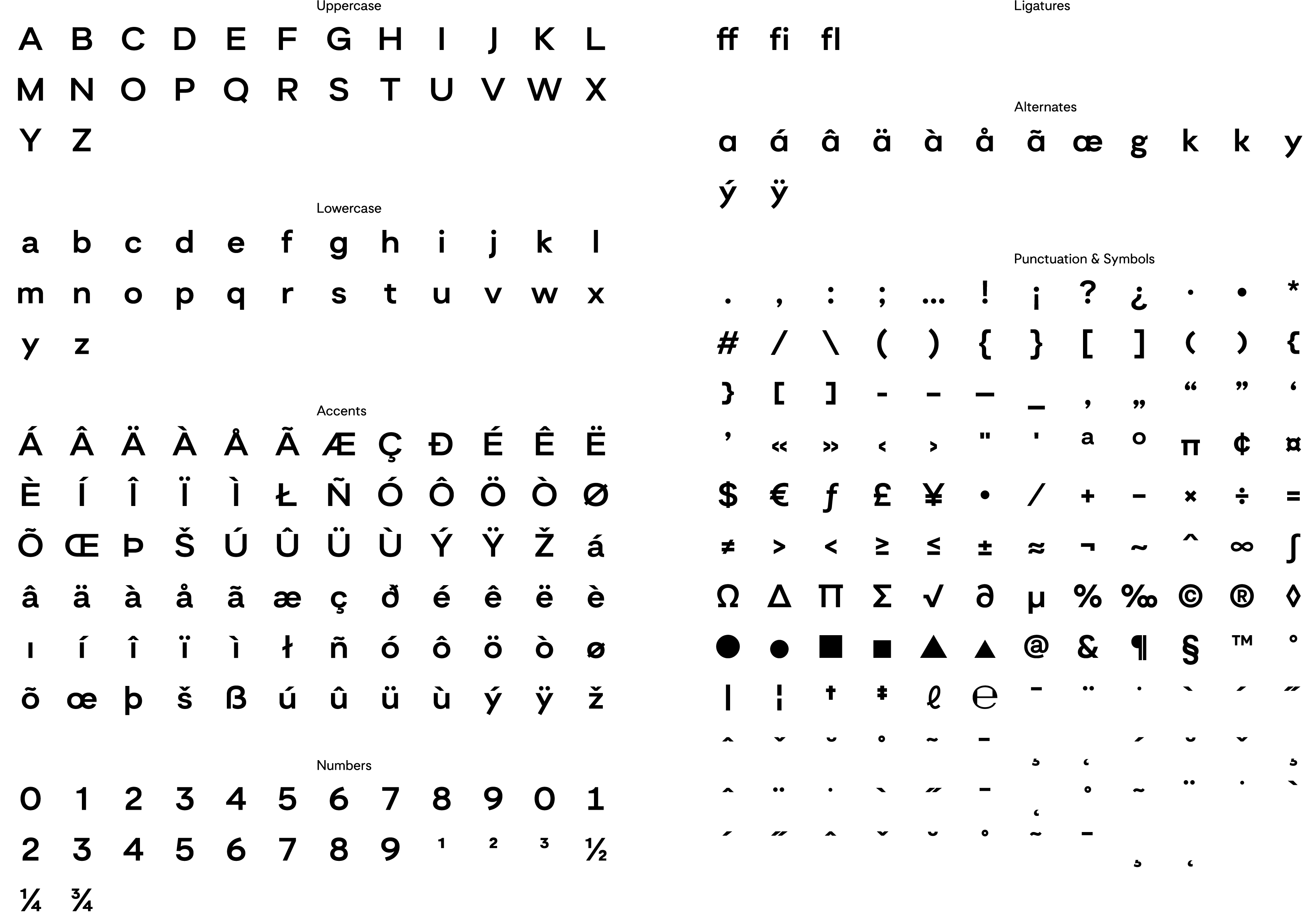
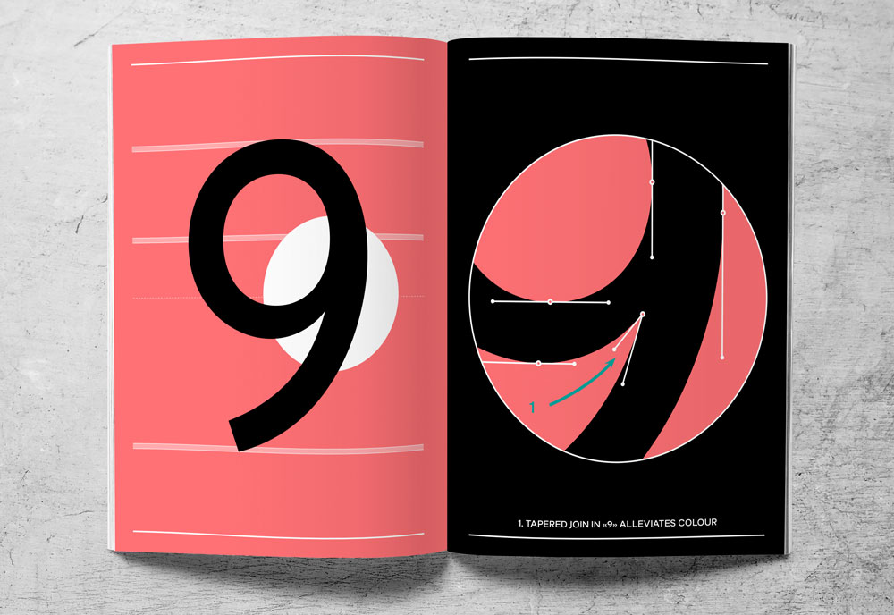
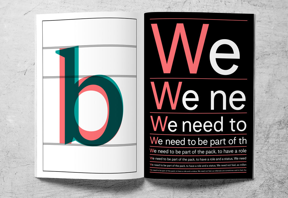
Motivo — Sans-Serif
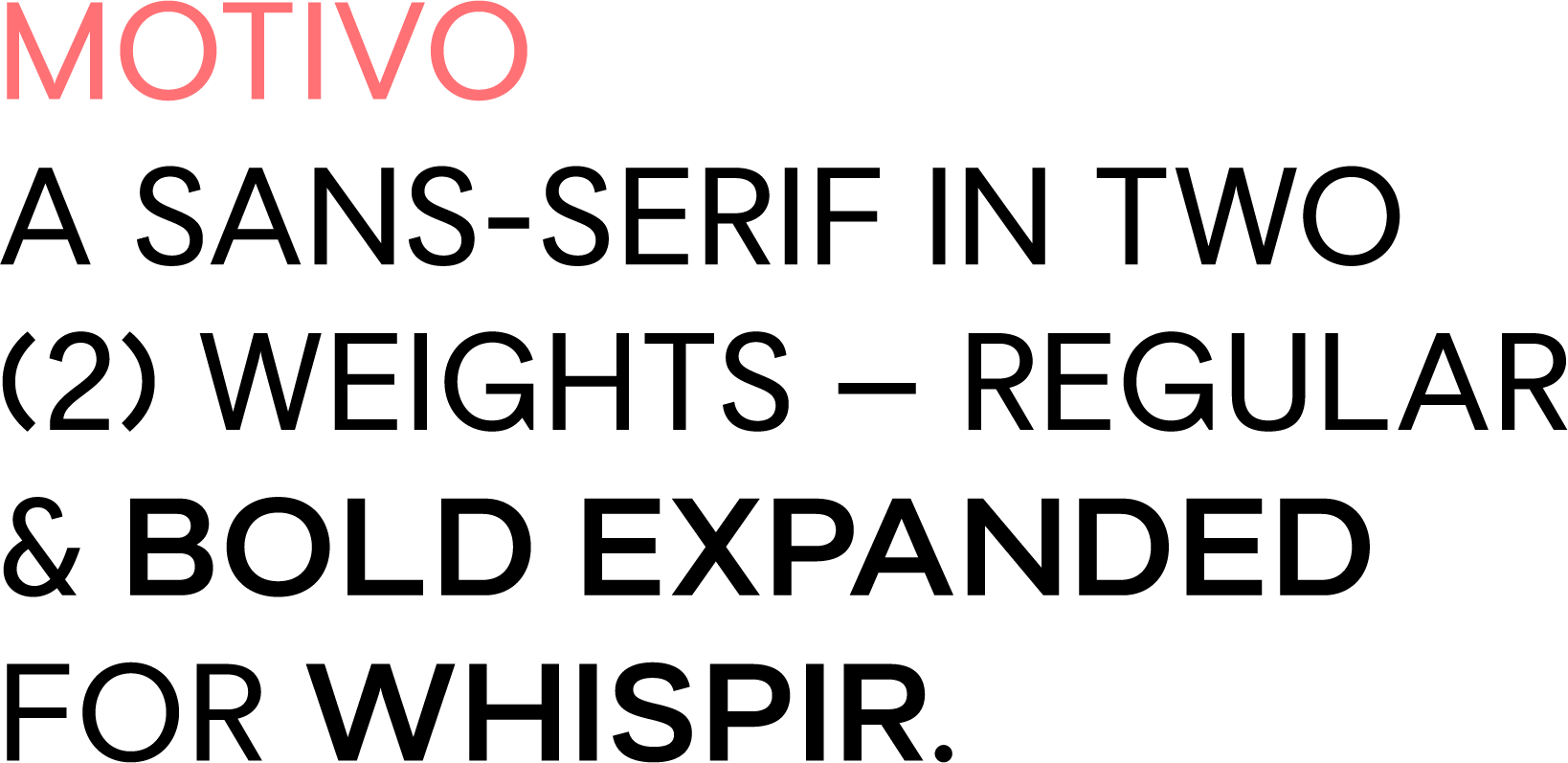
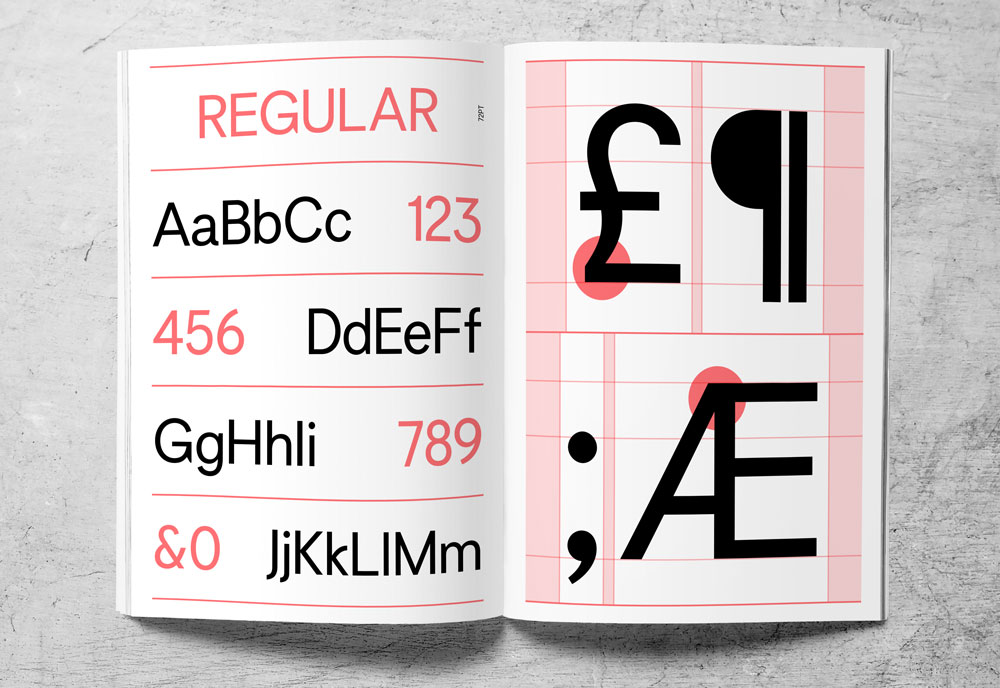
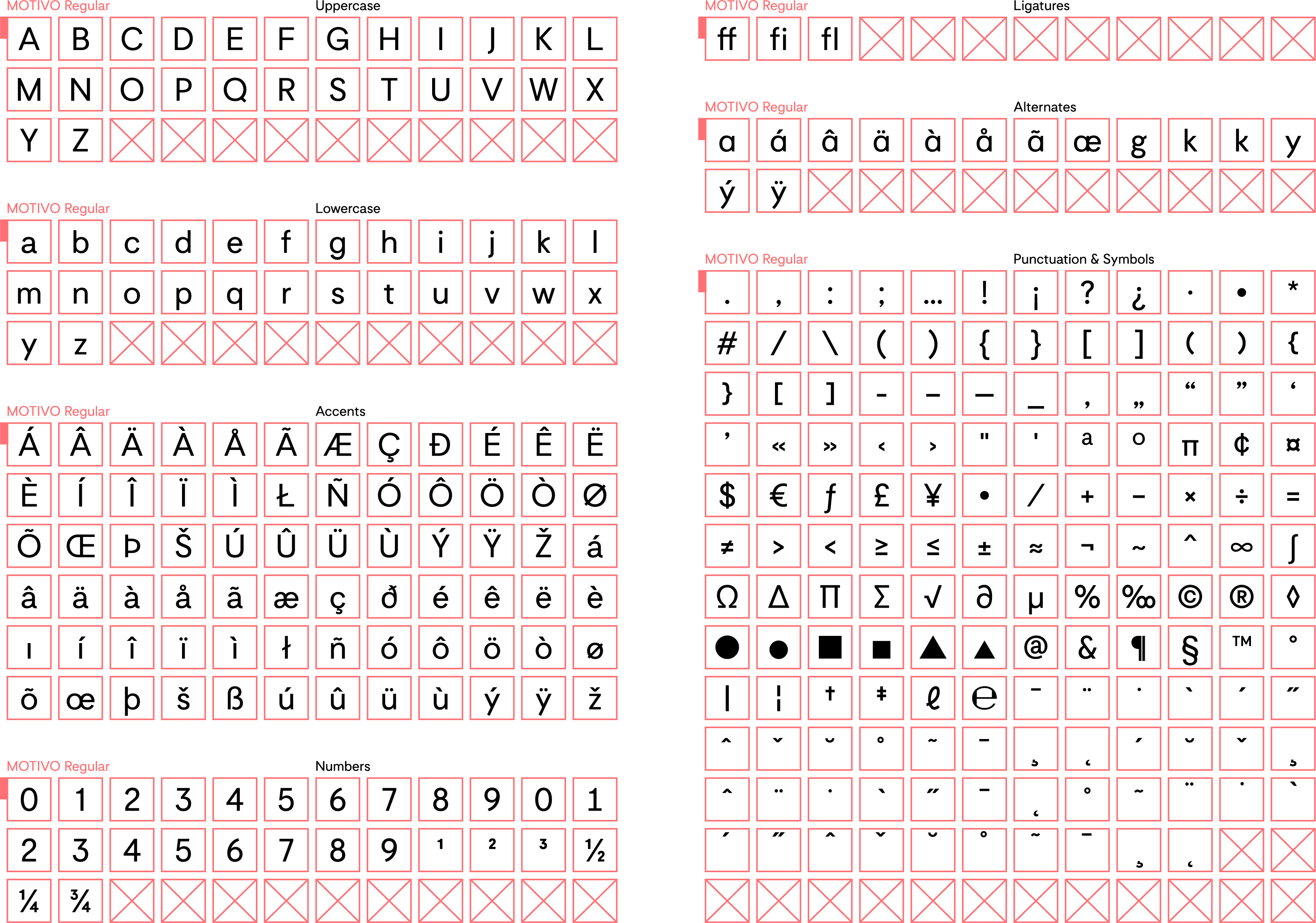
Motivo regular character set
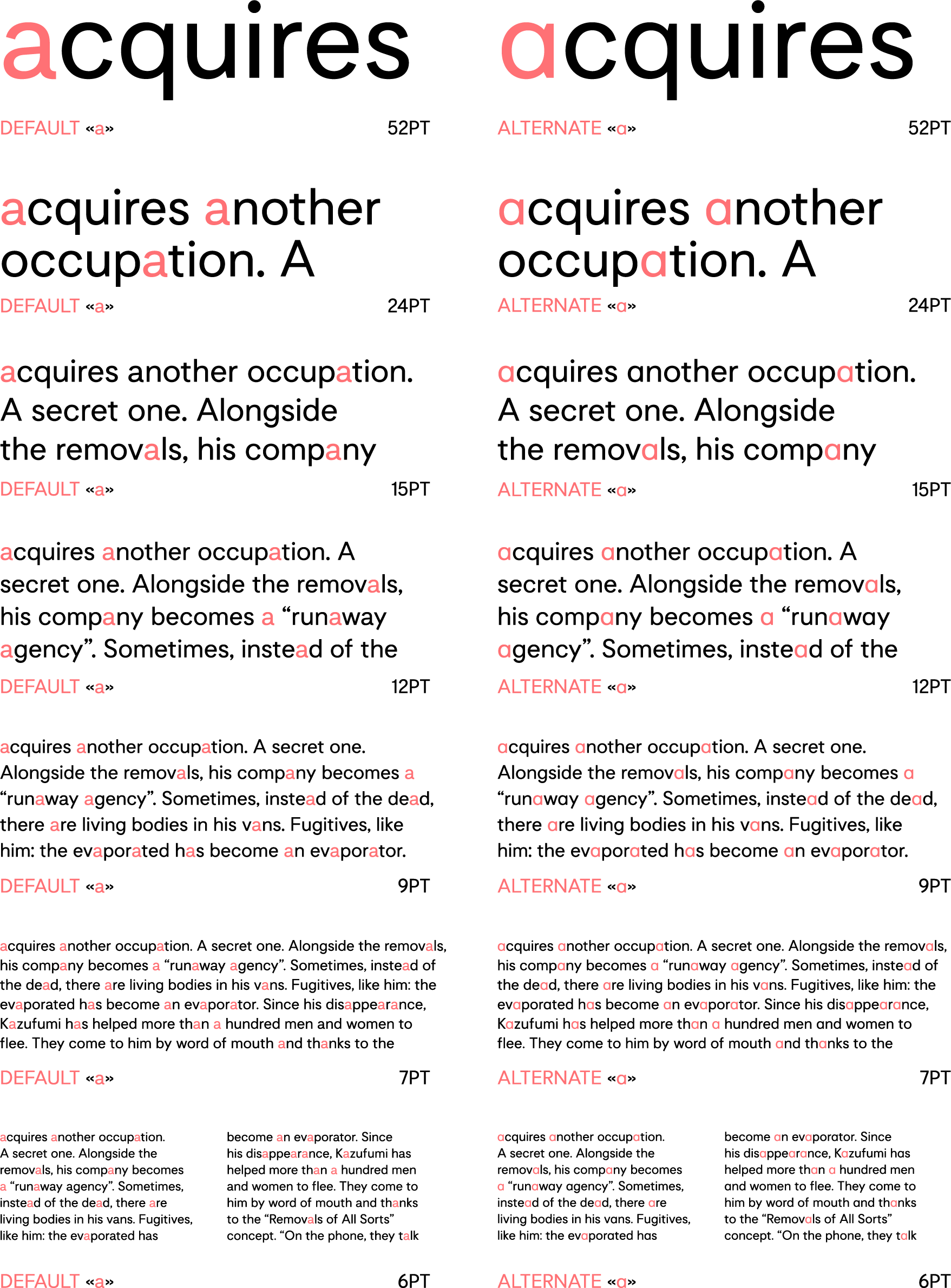
Alternate Ligatures
Reading sizes
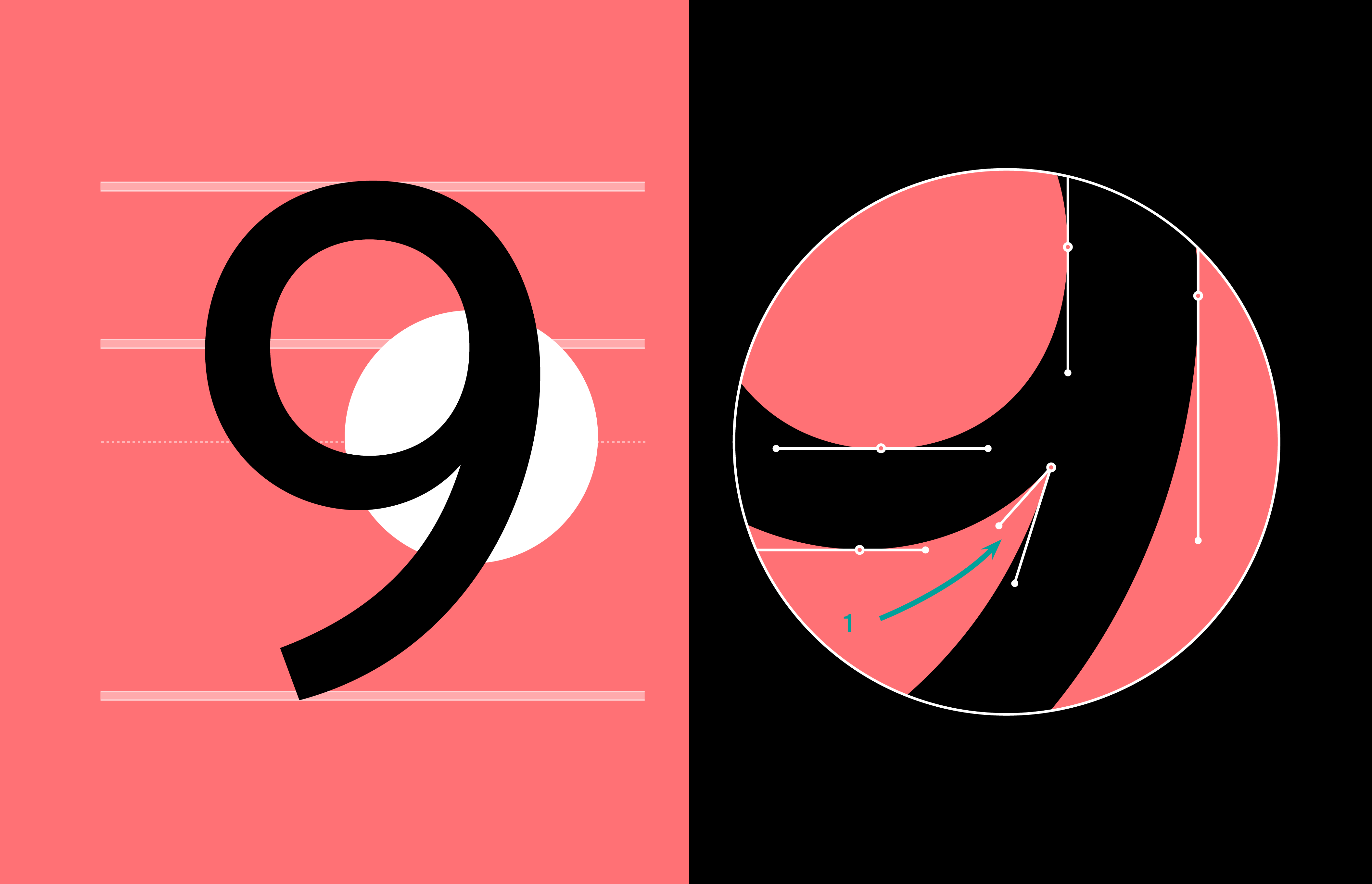
Motivo Bold Extended
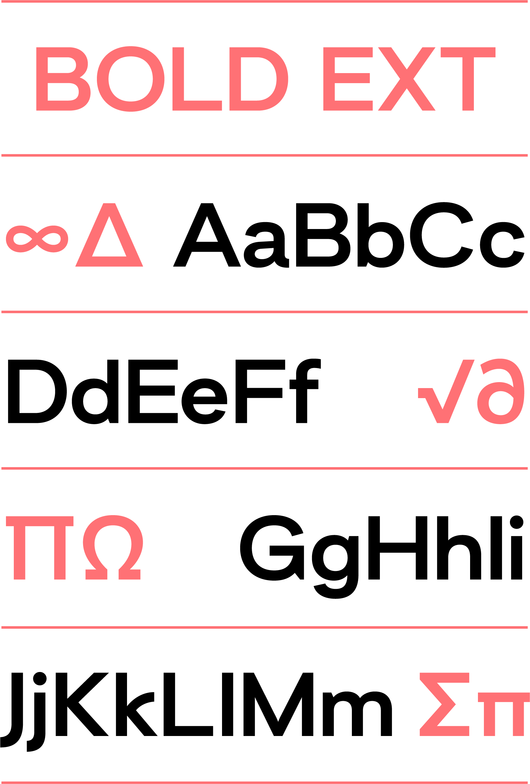
Motivo Bold Ext character set
